We use visualizations to make comparisons quite frequently. How we are doing relative to last year, our forecast, or our goals? Frequently comparisons have been visualized using gauges or multiple bar graphs. I don’t suggest gauges and using multiple bar graphs can be sufficient but depending on the amount of data you’re viewing they can take up a lot of space. In this post I’m going to show an alternative to gauges and multiple bar graphs.
How to create the simple bullet graph in Tableau

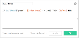
Each value on the graph needs to be a measure in the data set. For the Superstore data that meant creating calculations for 2013 and 2012 sales.
Once your data is in the right form you can start to create the visualization. For my example I put department, 2013 Sales, and 2012 Sales onto my sheet.
Create a dual axis by right clicking your second measure on rows or columns (depending on the orientation of your graph) and select "dual axis". When you create a dual axis in Tableau you are essentially over laying two independent graphs. Since the graphs act independently you can make one of the mark types a bar and the other a line, shape or other mark type.

Very important step!!! Since the measures act as independent graphs the axes can be different. Don't forget, if you do not synchronize your axis your visualization will NOT be an accurate direct comparison.
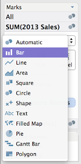
Adjust the mark types. The "actual" value will be a bar and the comparison value will be a gantt bar.
Increase the size of the gantt bar (remember that you have multiple marks in your marks card).
Hide one or both of the axis depending on preference and the amount of labels.
A couple of considerations when using the simple bullet graph:
Labels - depending on how close the actual value is to the comparison it might be hard to show both labels without overlapping and crowding. Two options to solve this issue are including the values in the tooltip or adding them as columns to the graph.
Hash mark visibility - sometimes the hash mark can be hard to see. One solution would be to add a border of the same color to the gantt bar mark. In other cases I have created a custom shape that is a skinny rectangle. Instead of using a gantt bar mark type I use a custom shape (skinny rectangle). Another alternative is use different sized bars like the example below.
To create a traditional Stephen Few bullet chart (shaded backgrounds to indicate ranges such as good, satisfactory, poor) I used reference lines to shade the background accordingly.


0 comments:
Post a Comment