We agreed that this map was useful because you could:
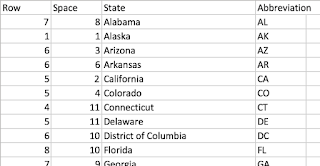
The idea is pretty simple. I broke the map into a grid and created a template in excel. A sample of the data can be seen in the image above.
After creating the template I connected to the data in Tableau and put
- "Rows" onto Rows
- "Space" onto Columns
- "State" onto the level of detail
- Created a Random calc for dummy data and put it into color (optional: change colors and add a border)
- Optional: To add space between the squares create a "one" calculation where the calculation contains 1. Drag up to dimensions and add to size. Adjust the size to get the preferred amount of white space.
- After that I just had to adjust the cell sizes and format the text
But now the question was "how do I get actual data onto the map?"
The first idea that came to mind would be to pre-aggregate each state and just add it to the excel template however in many cases that is not possible.
To get actual data on the map from a different data source I blended my map template in excel with the Tableau Superstore data. Both data sources must have a state field that match. Depending on your fields you may need to adjust the relationships.
- From the Superstore data put state onto detail and remove the generated lat and long from the rows and columns
- From the dummy example I followed steps 1 and 2 ("Rows" to rows and "Space" to columns)
- Instead of adding the Random calculation to color add the Superstore measure that you want to measure to color
- Follow the rest of the steps from the dummy example
Link to Periodic Table Map Workbook!
Download of Excel Tile Map Coordinates!


Nicely done Brittany.
ReplyDeleteThanks!!
DeleteGreat job Brittany! Can you provide the workbook that you used? :)
ReplyDeleteI just added a link to the workbook! Thanks!
DeleteAwesome, thanks!
ReplyDeleteGorgeous Brittany! Fantastic alternative when you need to include Alaska, Hawaii. Thank-you!
ReplyDeleteThank you so much Kelly!
DeleteGreat job seeing how many people are using this now is amazing. Thanks for making it so easy for others.
ReplyDeleteNice work, Brittany. This would make a great hands on TUG presentation.
ReplyDeleteThanks Andy! I'm going to be doing a quick presentation on it for Tableau Fringe Festival!
Deletehttp://www.wannabeawesomeme.com/tableau-fringe-festival